
a facelift
for herman
Client: Pittsburgh Brewing
Work: Branding, Illustration, Packaging
Wordmark by Dan Gurwin
Photos by Brian Kaldorf
Agency: Top Hat
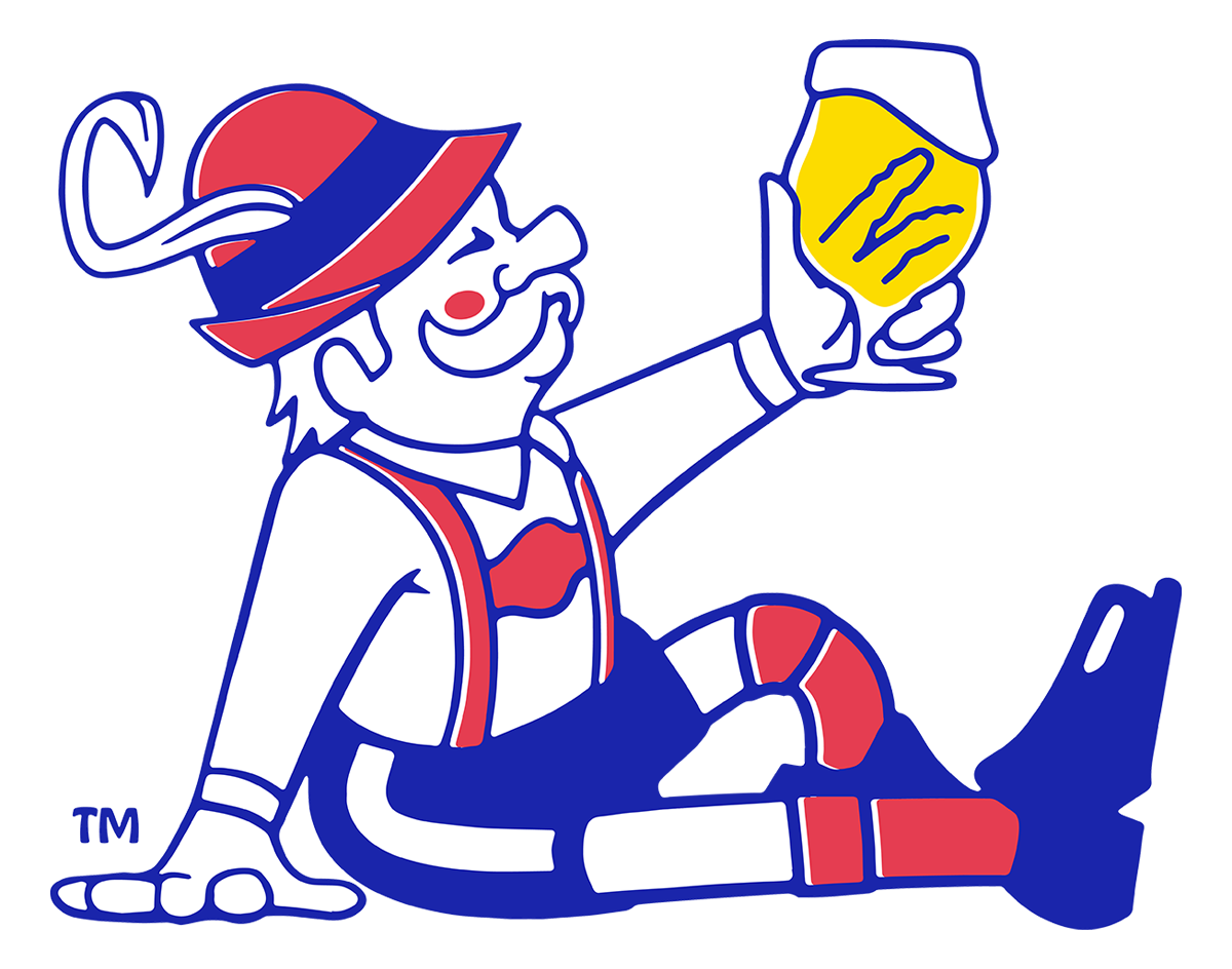
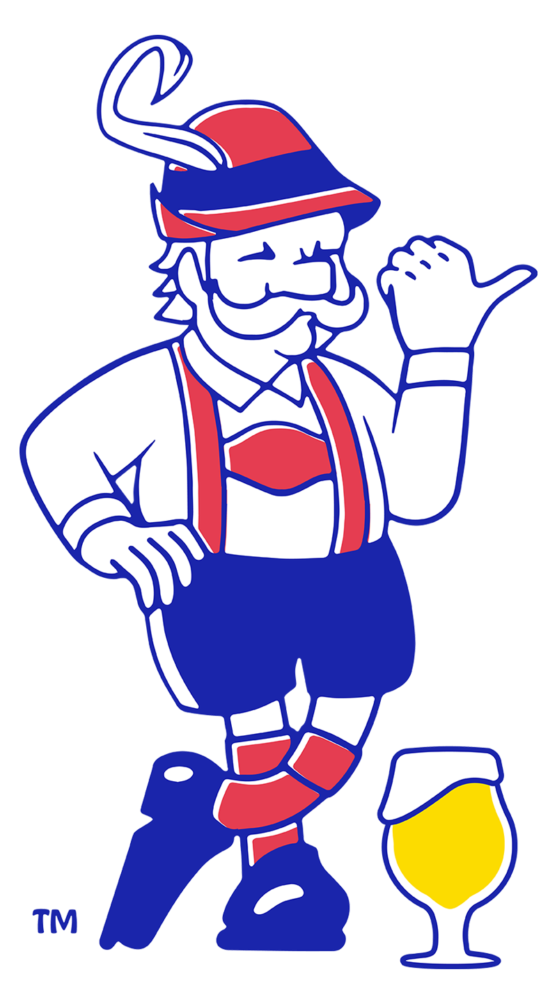
ORIGINAL LOGOREVISED LOGO

Consistent Line Weight
Brightened & Offset Colors


The original Herman illustration was… rough, to say the least. The line weight varied drastically, outlines were used inconsistently, and many details, such as the glass, were rendered very crudely.
Added Blush
Adition of Yellow
I resolved these problems with the new design while adding some fresh details. The addition of gold in the beer glass creates a nice, primary color scheme, and the offset red gives the illusion of a printing error, common on cheaper packaging.
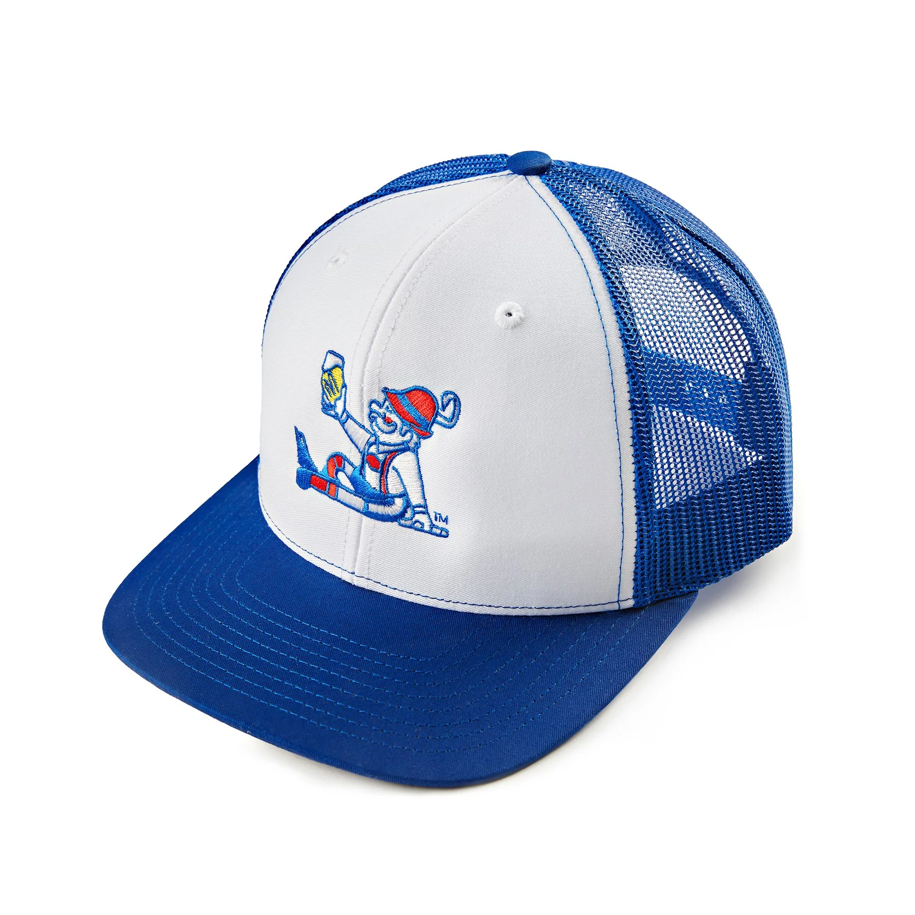
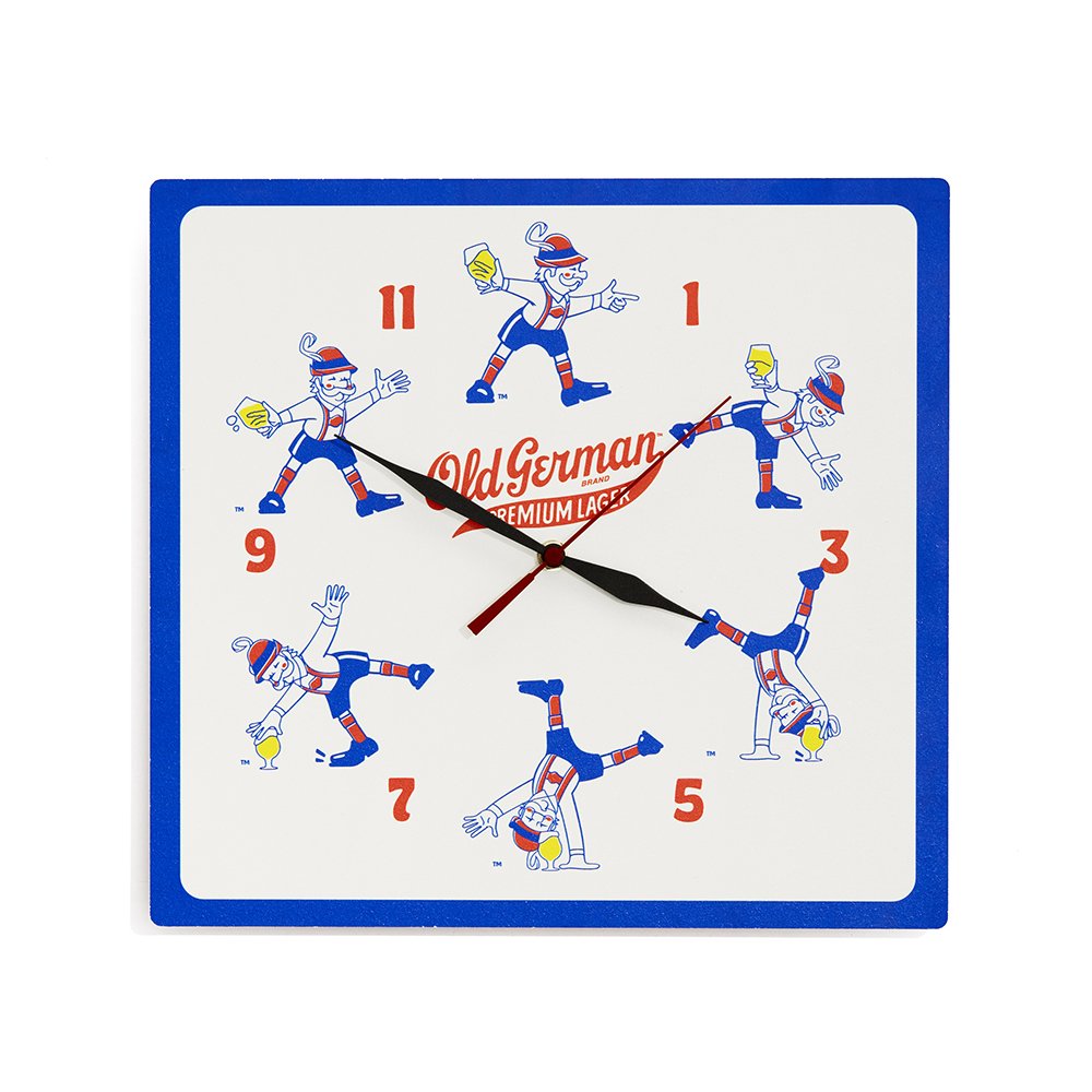
I wanted Herman to feel like more than a static icon, frozen in one pose. Drawing inspiration from older Herman packaging, I explored Herman from different angles and rendered him in various poses.


BEST BEER CANS 2022
a flexible herman

Herman is a man of the world, so it made sense to occasionally get him out of his lederhosen and put him in a new setting, whether promoting an event or celebrating summer.


