full of beans
Client: Press House Coffee
Work: Branding, Illustration, Packaging
Photos by Brian Kaldorf
Agency: Top Hat

I designed Press House’s wordmark to feel sophisticated, with a playful ‘E’ that resembles a French press. The rigidness of the wordmark is offset by a colorful background, adding a friendly aspect to the brand.
EXPANDED SYSTEM


BLEND ICONS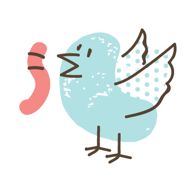


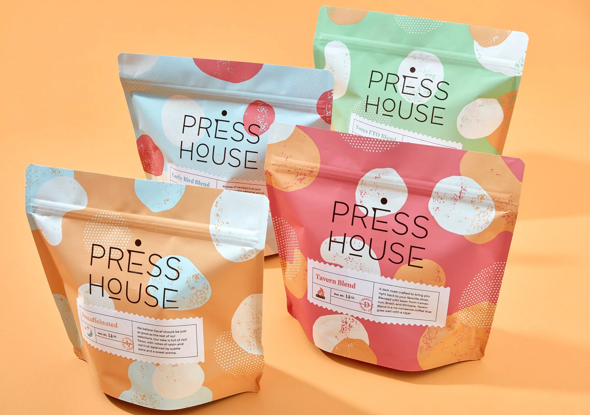
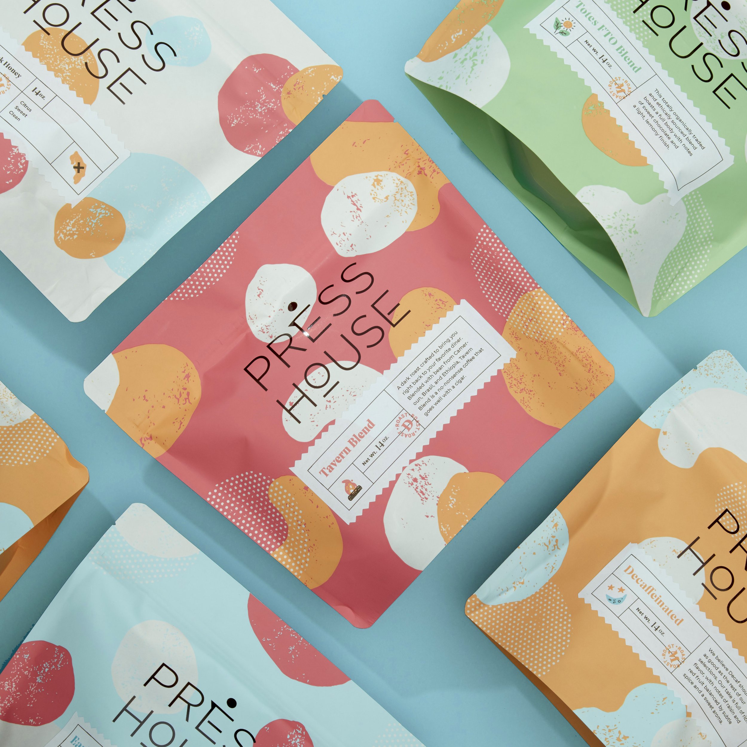
Packaging

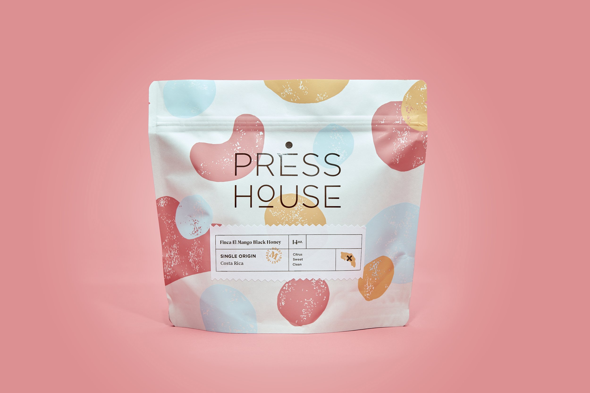
Press House packaging utilizes colorful patterns on the bags to evoke the layered flavors of the coffee inside, while the labels stick to a clean and strongly gridded format. The primary white bags contain single origin coffees, while colored bags indicate original blends.


An original product for Press House, each bag of Daily Grind contains a pre-measured serving of ground coffee. The packaging system uses the brand’s dark brown as the base color and a pattern of colored dots meant to echo the primary brand.

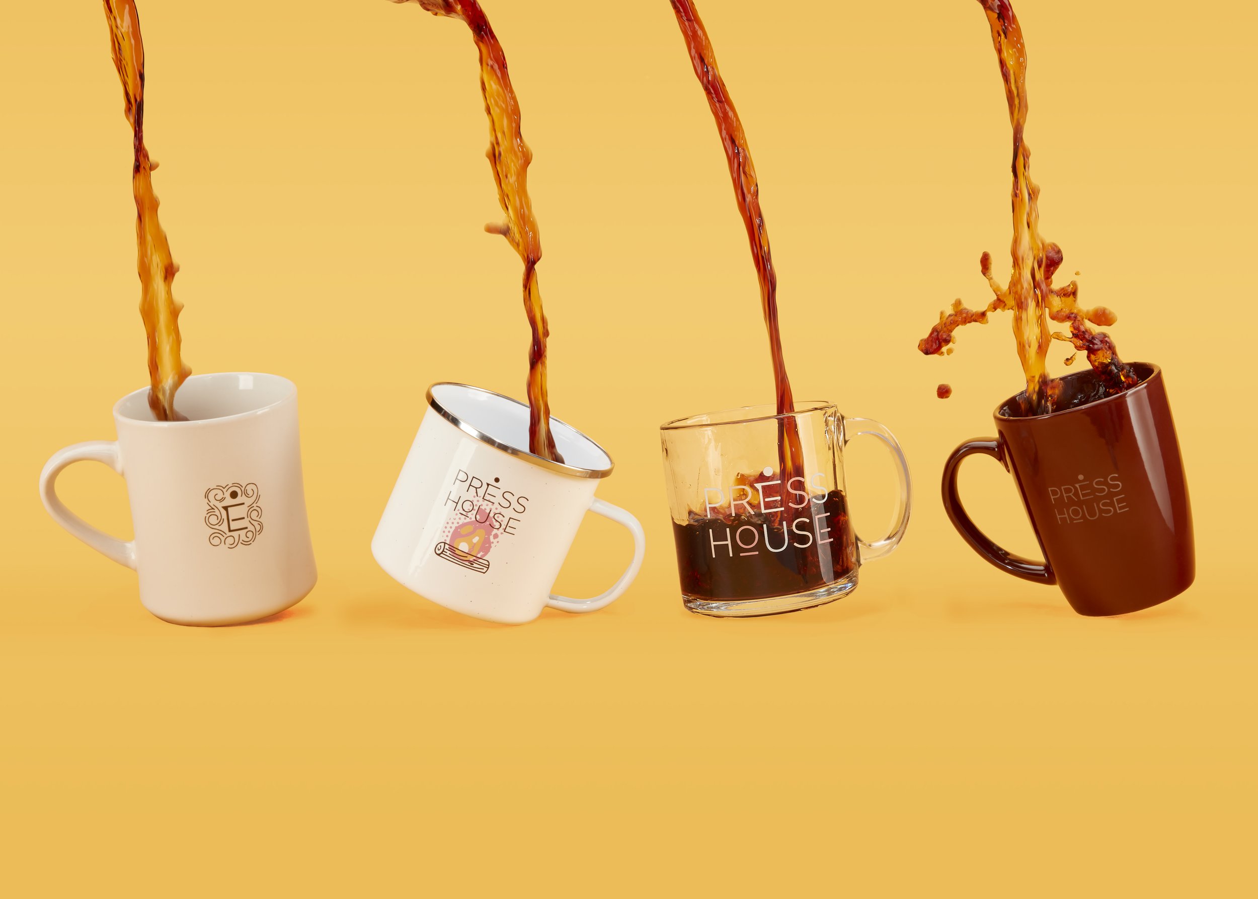
merch and shop


illustration

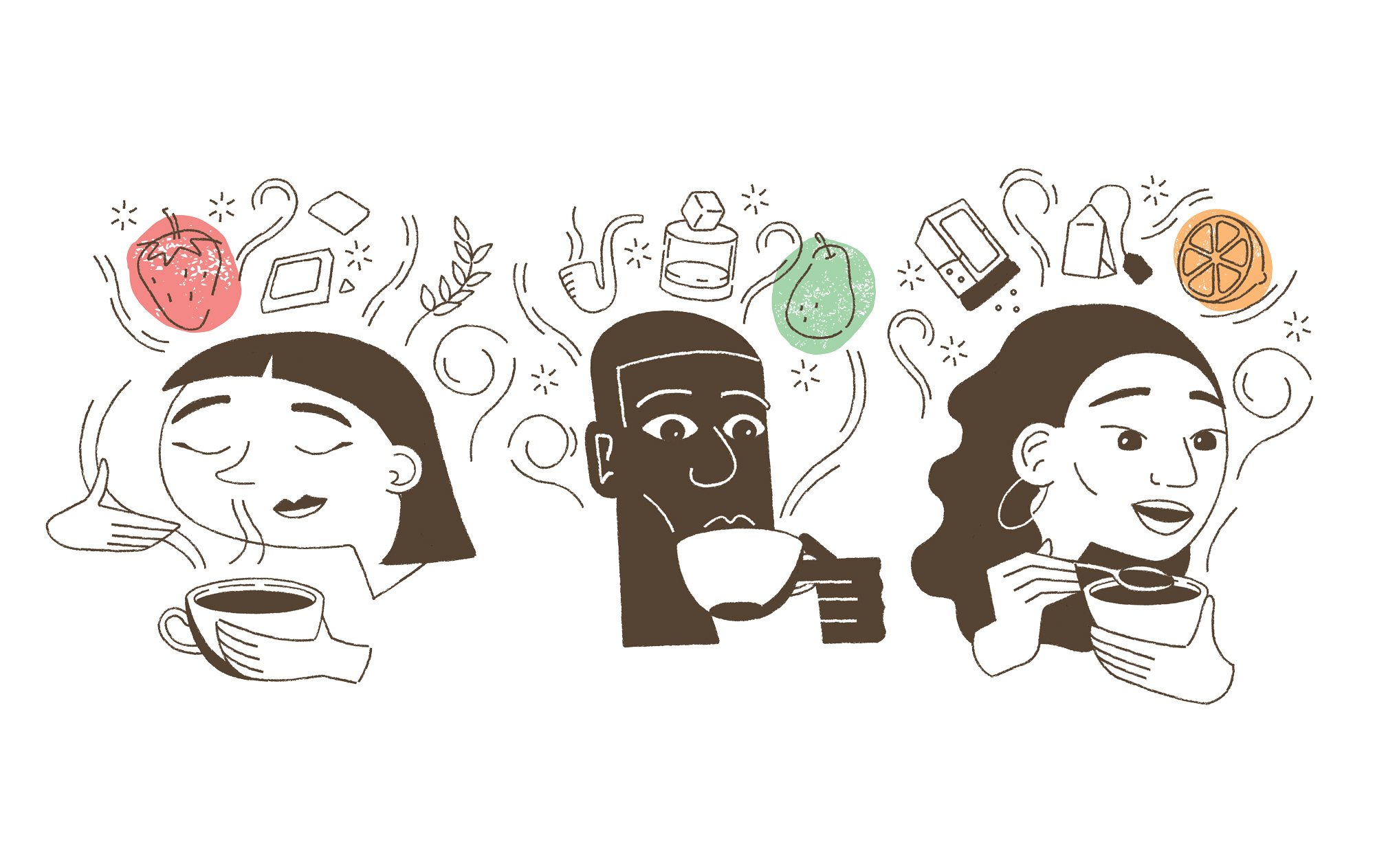
Press House’s illustrations were a later addition to the brand, but a natural evolution of the already established style. Textured line art with the occasional fill creates characters and objects, while colorful shapes add a layer of depth and highlight certain aspects of the illustration.