the heart of a brand
Client: Mother’s Brewing
Work: Branding, Illustration, Packaging
Photos by Brian Kaldorf
Agency: Top Hat
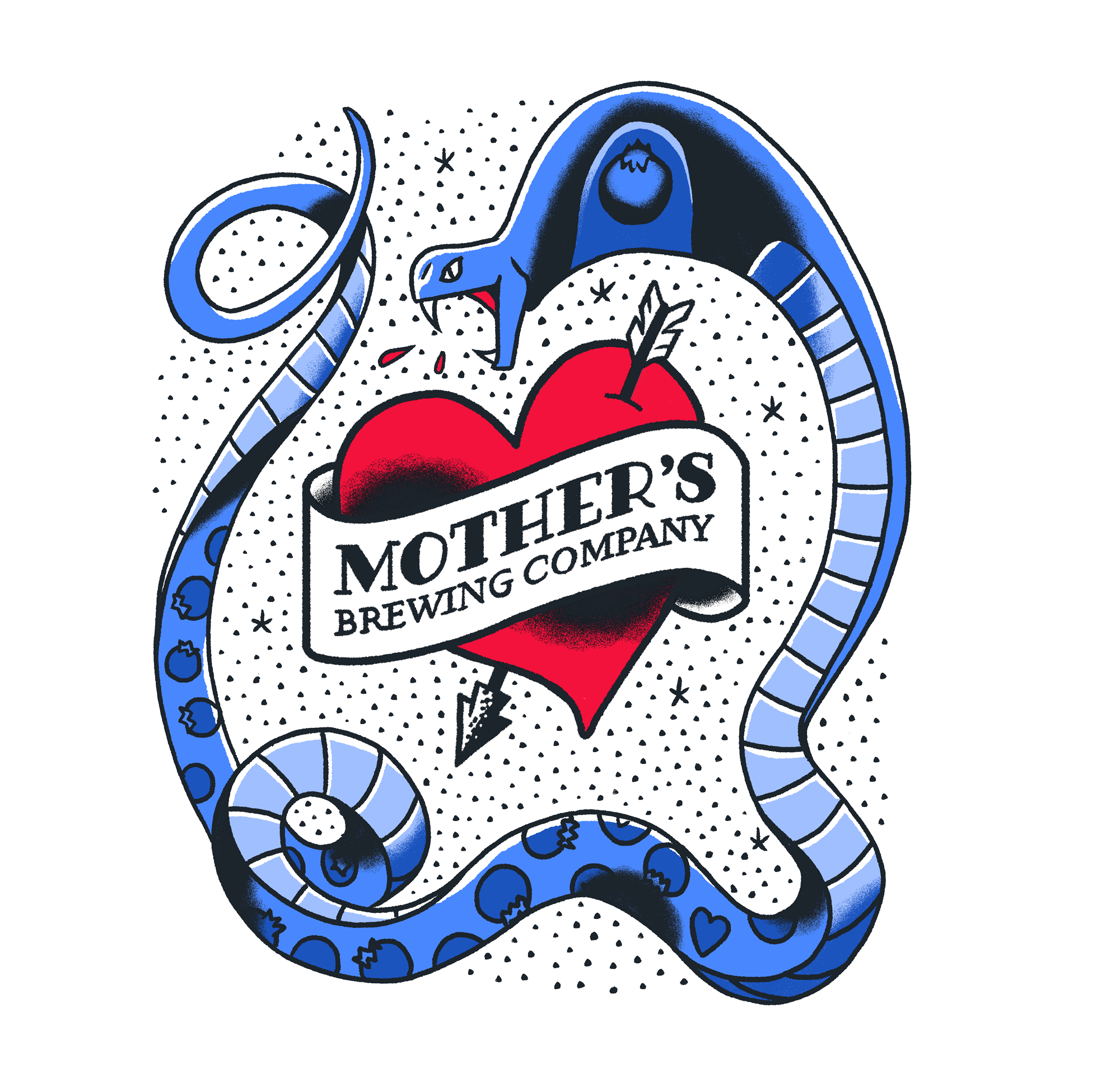
REVISED LOGOORIGINAL LOGOMother’s had all the pieces of a great brand, but lacked execution and focus. I revised their heart logo to fit the aesthetics of American Traditional Tattoos, using bold color and shadow. This gave the brand a more ownable aesthetic, and by redrawing the logo I corrected some of the original’s lopsided qualities and disparate typography.
EXPANDED SYSTEMpackaging
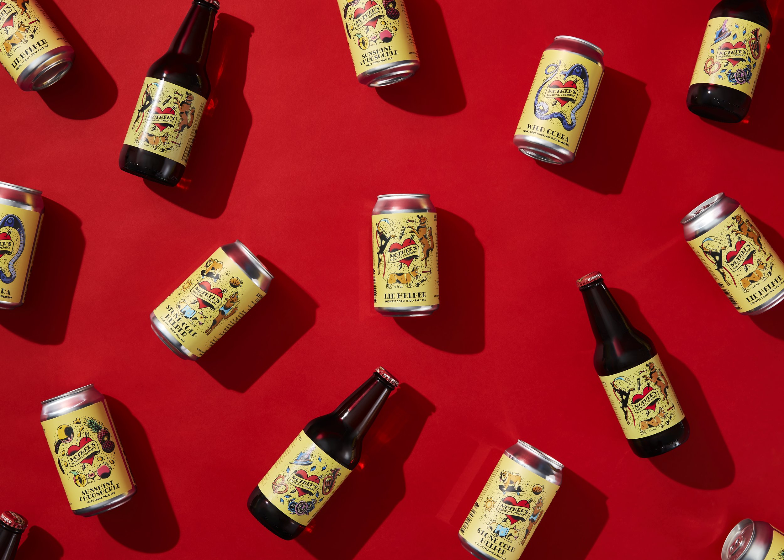
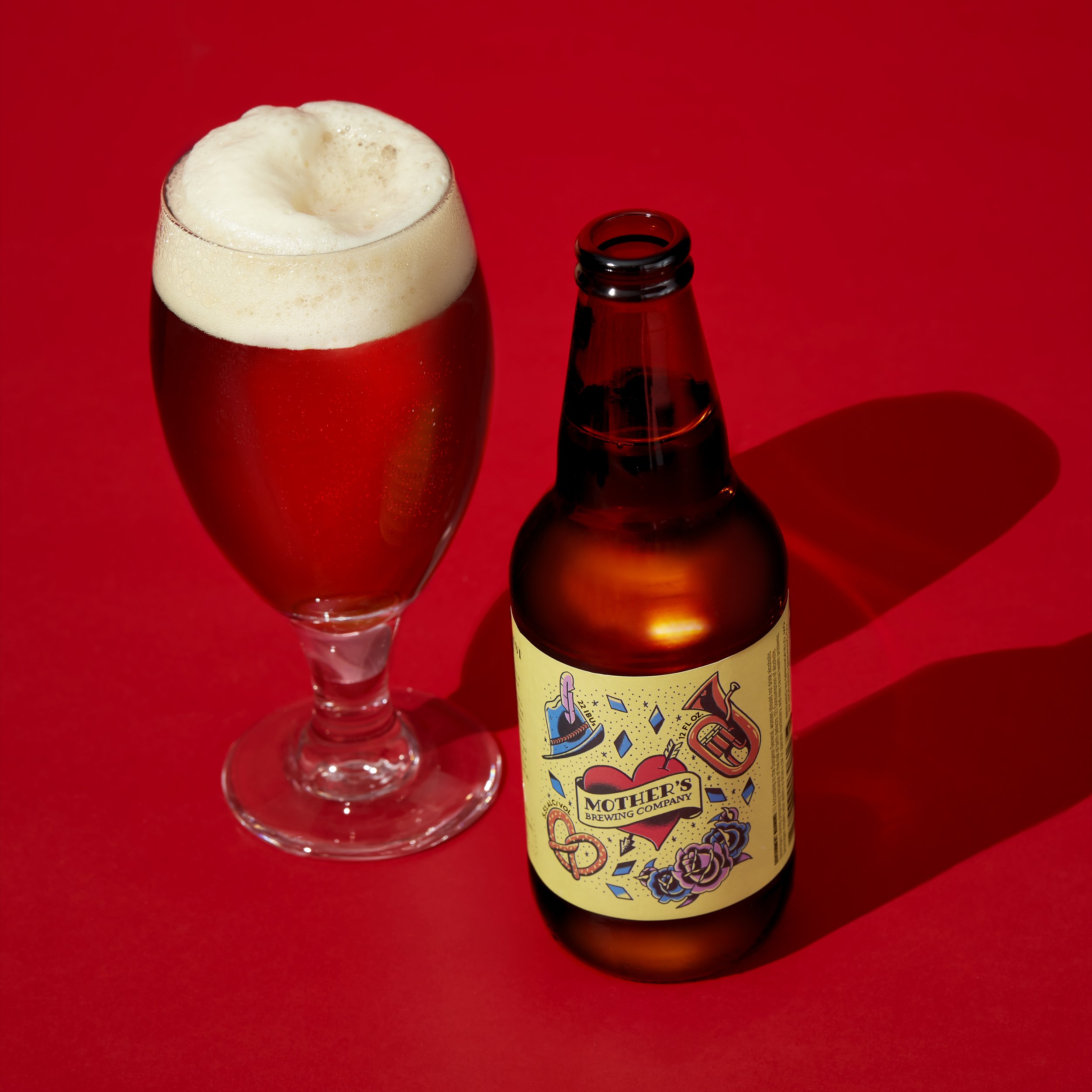
The packaging system is a natural extension of the logo, framing the heart in an illustration that continues the motif of American Traditional tattoos. The remaining space within the design is filled in with a star and dot motif that is common for many tattoo sleeves in this style.
Trop Top — Tropical Pale Ale
Winter Grind — Coffee Stout
Lake Break — Easy Drinking Ale
Cobra Scare — American Blonde Ale
Towhead — American Blonde Ale
Wild Cobra — Blueberry Sour


