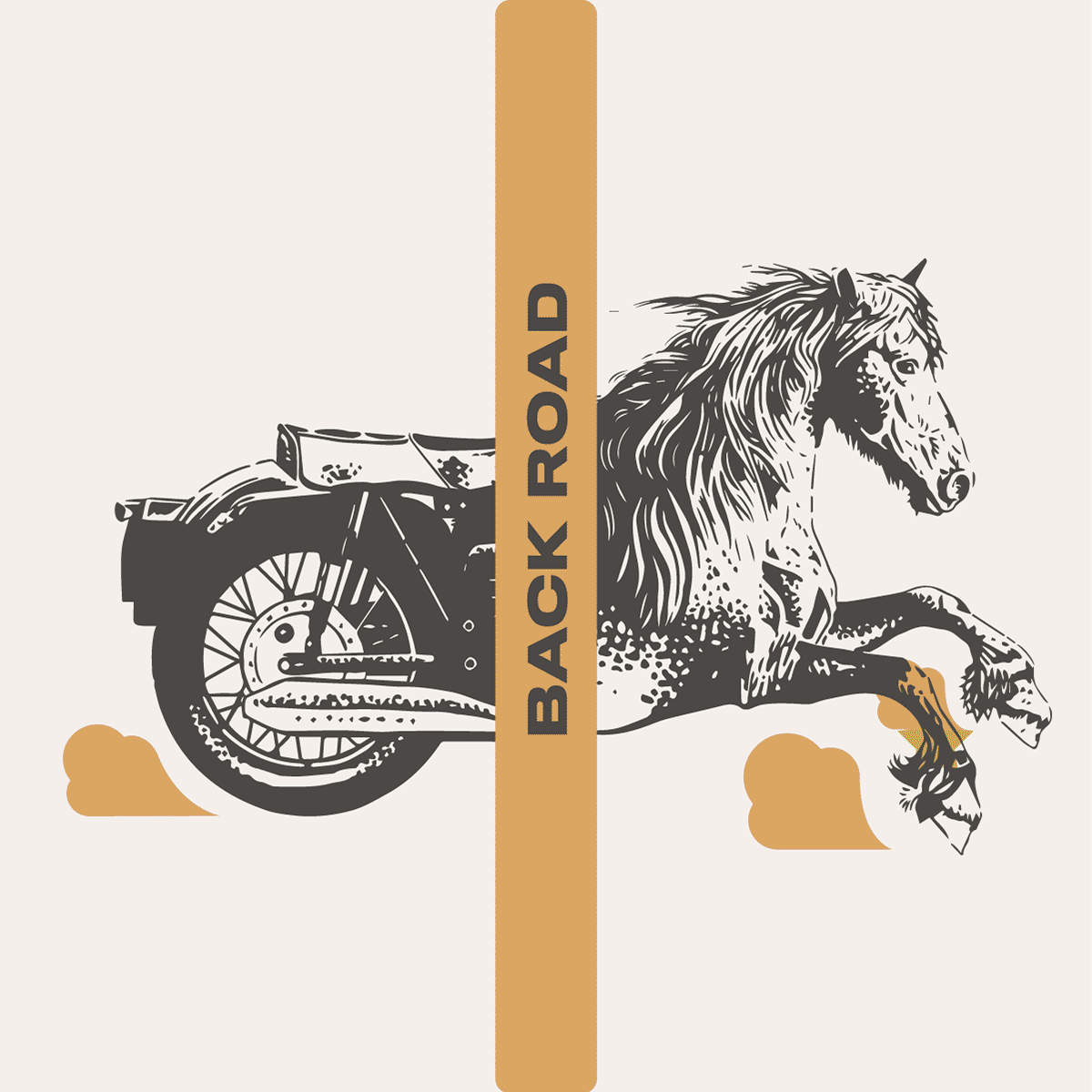
split personality
Client: Hobbs Brewing Co
Work: Illustration
Type setting and logo by Robert Baker
Photos by Brian Kaldorf
Agency: Top Hat
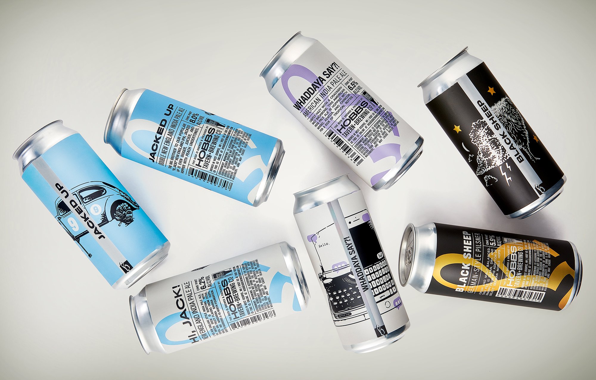
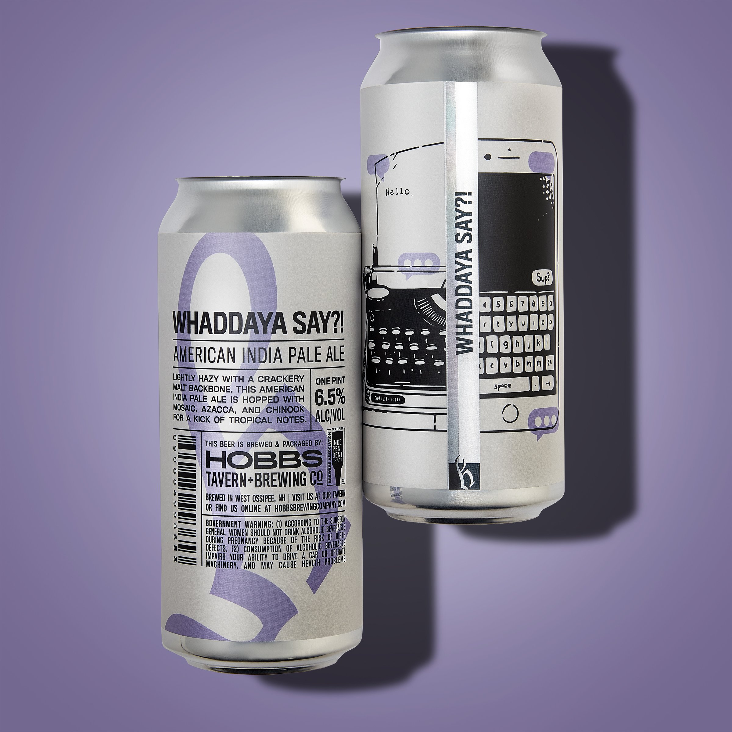
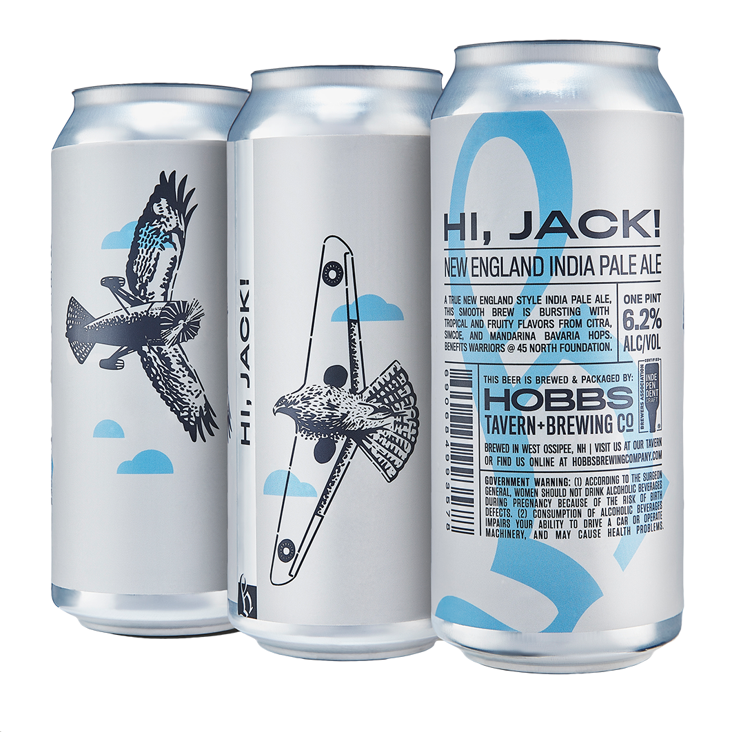
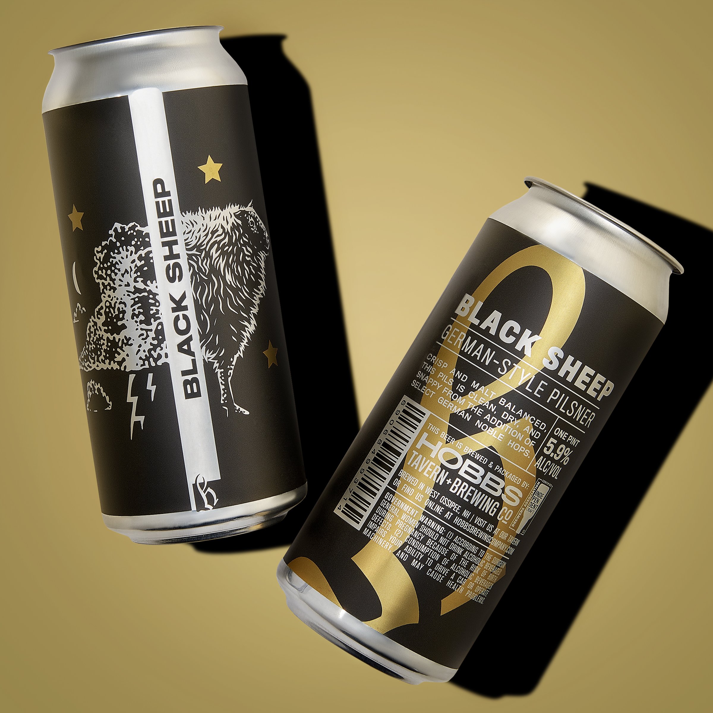
The concept for Hobbs’ packaging was to use a traditional format, similar to newspaper editorials, and modernize it. The front of the can features tightly gridded typography, laid out by Robert Baker, while the back features my illustrations.
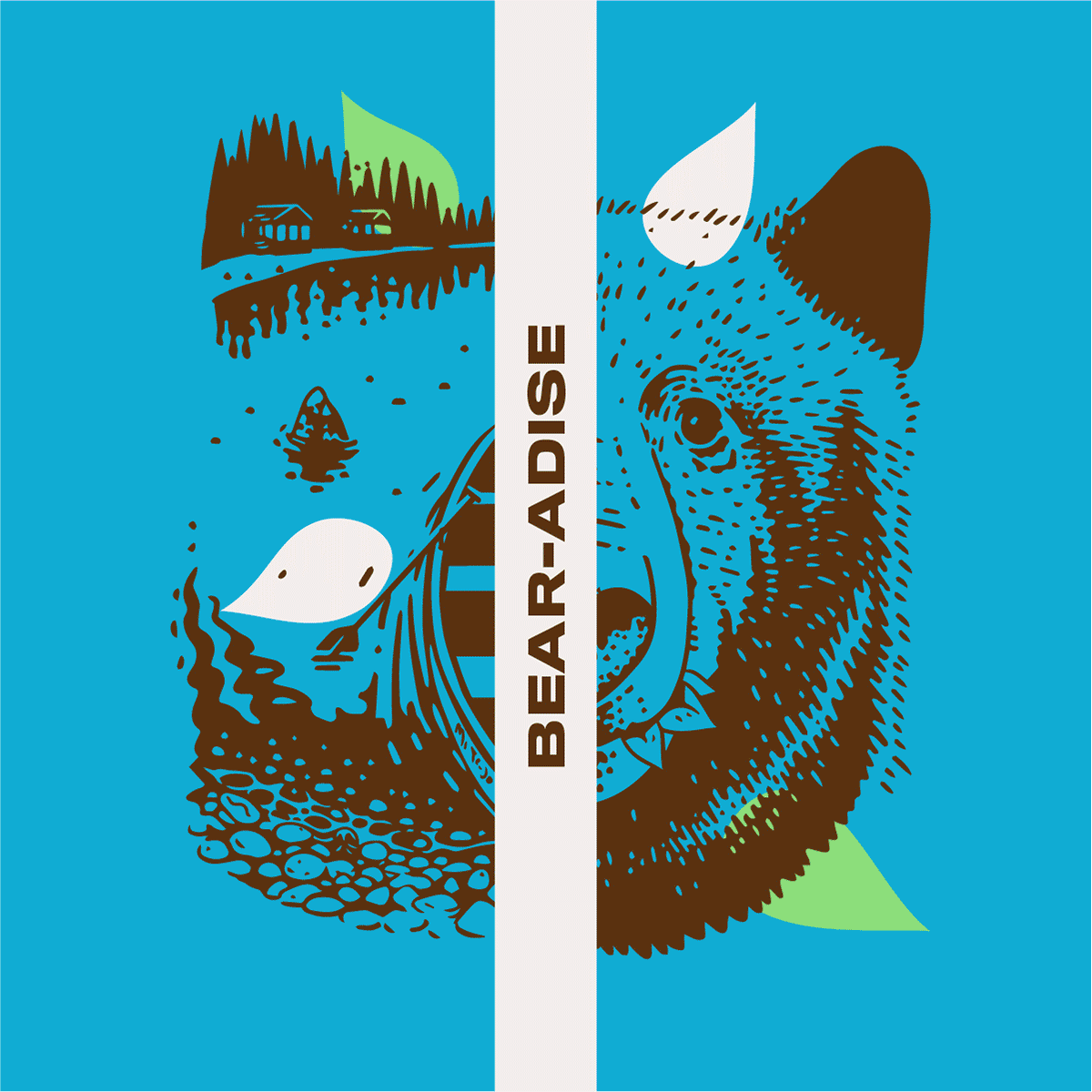
The label’s seam became a central part of the can’s design, creating a prominent, metallic strip that splits the illustration in half. Sometimes two different subjects mirrored each other on each half, and in other instances a single, a collaged illustration crossed over the divide.